Being Responsive to the Small Things
Jonathan Snook considers the problem of container (or element) queries in the context of responsive web design and looks at the approach taken by current open source JavaScript solutions.
Find out how to use container (or element) queries today, what is the difference between an SVG clipPath and a CSS clip-path, what Expressive CSS is, and more.

Jonathan Snook considers the problem of container (or element) queries in the context of responsive web design and looks at the approach taken by current open source JavaScript solutions.

Dennis Gaebel explains the difference between an SVG clipPath and a CSS clip-path, including examples to guide and inform you through this journey.

Top design resources beat ugly sweaters every time. Creative Market invites you to save 20% now through December 25th — whether you’re on the nice list or not! Ready to shop? Visit the discount page and grab some of our most popular fonts, graphics & themes.
Rachel Andrew unwraps the new paradigms of web layout, comparing their features and showing how they can free us from grid-based, div-infested frameworks.
Expressive CSS is an approach to writing lightweight, scalable CSS using utility classes that are easy to write and understand.
Kitty Giraudel introduces CSS Modules Methodology, explains its advantages, and shows how you can get started with it.
Matt Hinchliffe explains why it’s so hard to create good fallbacks for SVG icons.
Vaclovas Vicius gives a straightforward review of the Foundation 6 framework.
ScrollReveal is a small library that lets you easily create scroll animations for web and mobile browsers.
Flexibility is a polyfill for Flexible Box Layout Module Level 1. It will let you design flexible layouts on the web without sacrificing the experience in older (Internet Explorer) browsers.

Give yourself permission to write incomplete and imperfect stories. They’re yours and their value comes from more than technique.
If you enjoy this newsletter, please consider supporting us on Patreon. Thank you!
Happy coding,
Zoran Jambor

A handy online tool that will let you easily show Baseline Status in your videos.

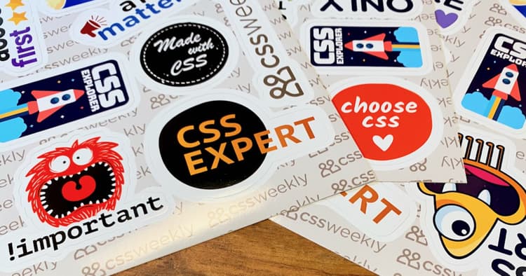
A set of beautiful, cute, and funny CSS stickers to showcase your love for CSS.

