If you ever wanted to create reusable modules that can be placed into differently sized containers, you’ve probably found that media queries aren’t really enough. What you’d actually need in this case are element queries. Element queries, in contrast to media queries adapt elements based on their containers’ size, not based on the viewport’s size. You’ll be happy to hear that work on element queries has already started (although only as a JavaScript polyfill at the moment). I for one am looking forward to this.
Read more
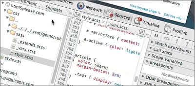
Did you know that Chrome DevTools allow you to view and edit Sass source files rather than generated CSS files? If not, it’s about time you learn everything there is to know about it, because this will be a huge improvement to your Sass development workflow.
Read more
Ben Smithett explains how his team used Sass, SMACSS and BEM to make the legacy CSS for the Envato marketplaces (including ThemeForest) scalable and maintainable.
Read more
Manoela Ilic created an impressive set of experimental modal window appearance effects with CSS transitions and animations. Definitely worth checking out.
Read more
Sven Read shares a number of excellent typography tips & tricks that will make your typography shine (so to speak).
Read more
Les James shares a technique where you can pass “named” media queries from CSS over to the JavaScript, which uses those names to swap out the image for the appropriate one for that media query.
Read more
Twitter Bootstrap is an excellent framework that might (or might not) be appropriate for your next project. Sam Holt offers a few notes that could help you decide if you should use Bootstrap or maybe some other front-end framework.
Read more